Quiet luxury brand imagery is doing more work than most small business owners realise. Before your audience reads your offer, your headline, or a single line of copy, they have already formed an opinion. That opinion is built entirely on what they see. This post explores the psychology behind that process and why organic, considered visual choices are one of the most powerful positioning tools available to a growing brand.
This post explores why quiet, considered imagery is one of the most powerful positioning tools available to small business owners, and what the psychology of visual perception tells us about how your audience is actually forming their opinions.
What happens in the first seven seconds
Research consistently shows that people form a first impression in under seven seconds. In a digital context, where a potential client is scrolling through a feed or landing on your website for the first time, that window is likely shorter. What they are processing in that moment is not your copy. It is not your offer. It is the visual signal your brand is sending.
Colour, composition, and tonal consistency are processed by the brain before language. Your imagery is communicating before you have said a single word. This is not abstract design theory. It is how human perception works. The question is whether your visual choices are sending the right signal.
The psychology of visual consistency and trust
Consistency is one of the primary mechanisms through which trust is built. In psychology, this is rooted in the concept of cognitive fluency: the ease with which the brain processes information. When something is visually coherent and familiar, the brain processes it more easily, and that ease is experienced as trustworthiness.
A brand that looks the same across every touchpoint, your website, your Instagram grid, your email header, your Pinterest board, is a brand that the brain processes as stable and reliable. Conversely, a brand that presents differently across channels creates a low-level sense of friction. The audience may not be able to articulate why they feel uncertain. But the inconsistency registers.
A study by the University of Loyola found that colour alone increases brand recognition by up to 80 percent. Recognition is the precursor to trust. And trust is the precursor to purchase. Visual consistency is not a design preference. It is a revenue mechanism.
Why quiet luxury works as a visual strategy
Quiet luxury, as an aesthetic movement, is a direct response to oversaturation. Decades of loud, high-contrast, trend-chasing visual culture have conditioned a significant audience segment to associate restraint with quality. Brands like The Row, Loro Piana, and Brunello Cucinelli have built global reputations almost entirely on the principle that understatement signals confidence.
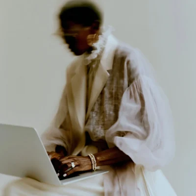
For small business owners, coaches, consultants, and digital founders, this principle translates directly. An Instagram grid built around soft organic tones, considered composition, and a coherent colour palette communicates something very specific to a premium audience: that this brand knows what it is, and does not need to compete for attention through volume.
The quiet luxury aesthetic is not simply a colour palette. It is a positioning statement. And it is one that works particularly well for service-based and knowledge-based businesses, where the sale is built entirely on perceived credibility.
The case for organic and natural imagery
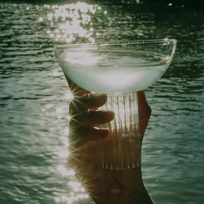
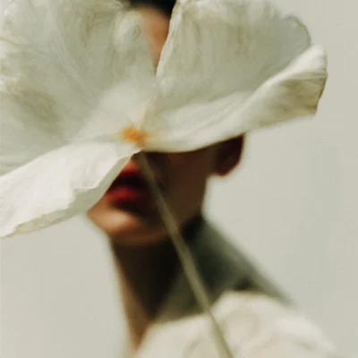
There is a reason the natural world has been a reference point for premium visual communication across centuries of design and art direction. Organic form, open landscape, and botanical detail carry associations that are deeply embedded in human perception. Calm. Clarity. Considered taste. These are not manufactured feelings. They are responses to imagery that has texture, space, and a connection to something real.
In practical terms, natural imagery also ages well. Trend-driven visuals have a shelf life. A feed built around sage green landscapes, warm stone textures, and botanical close-ups will look as considered in two years as it does today. For a business investing in evergreen content, that longevity is significant.
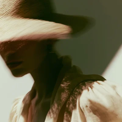
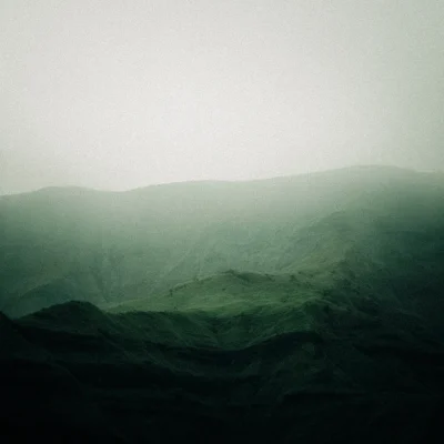
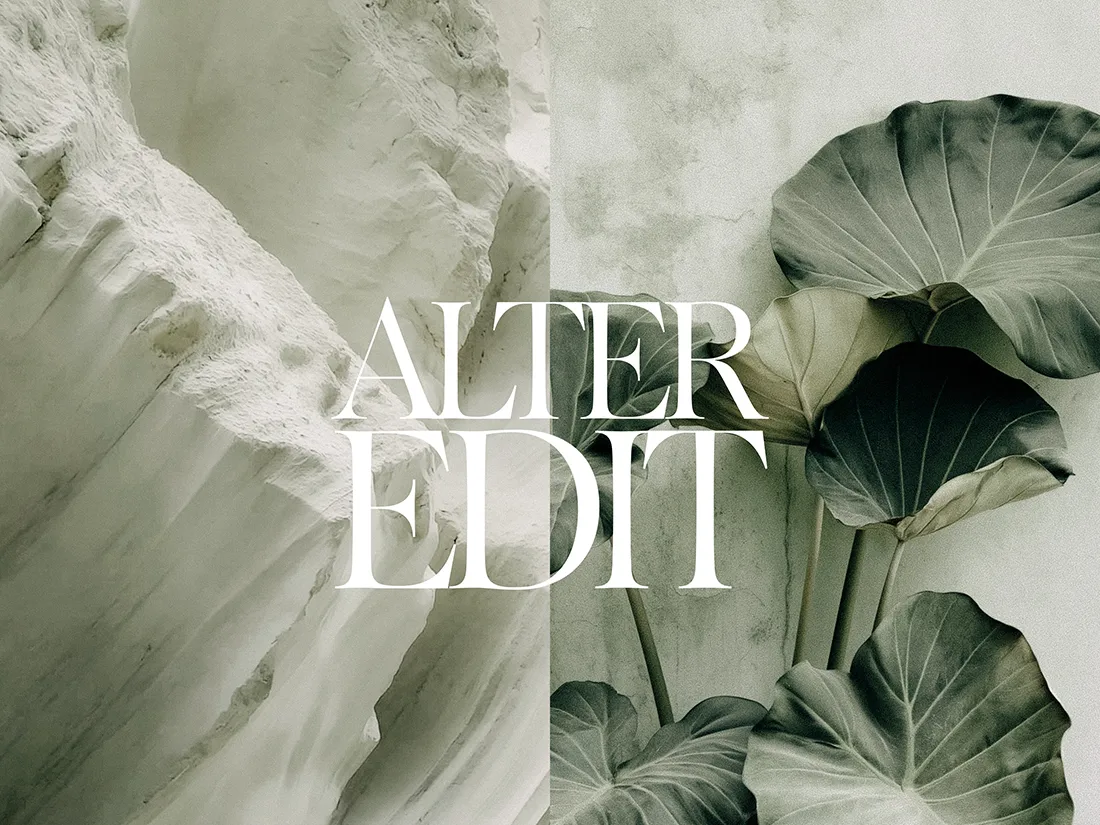
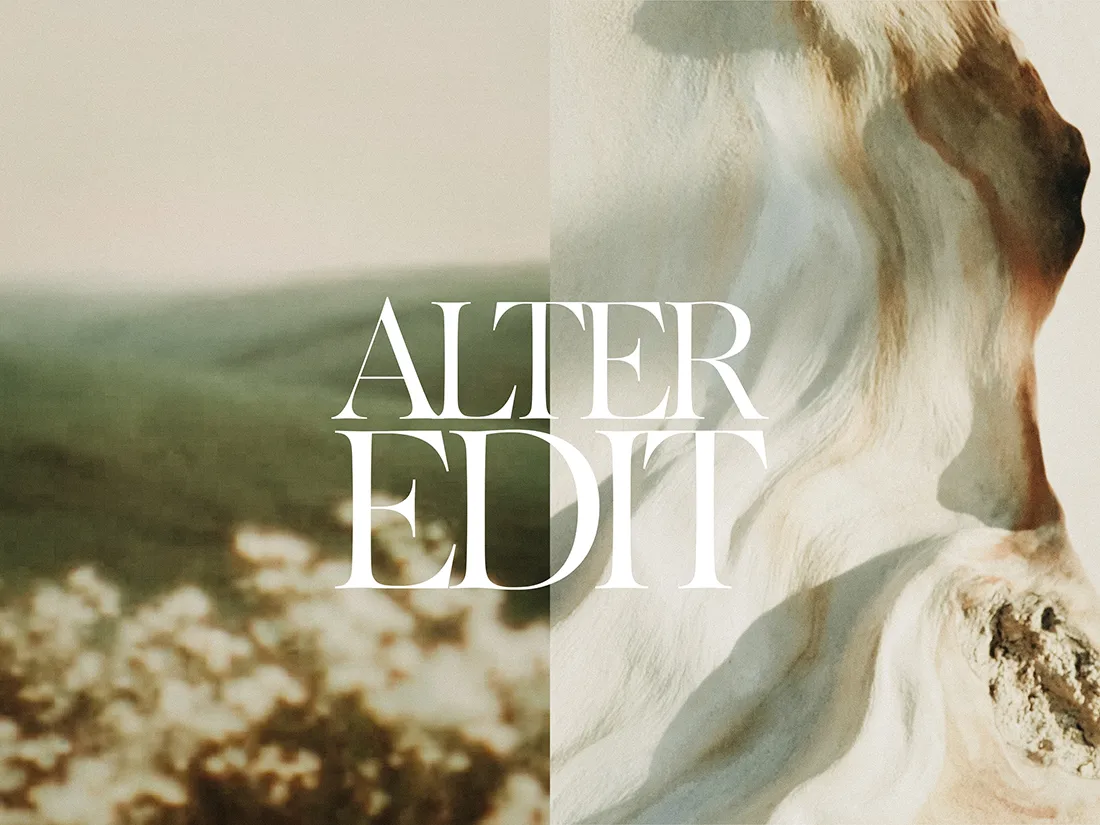
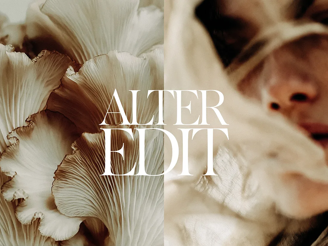
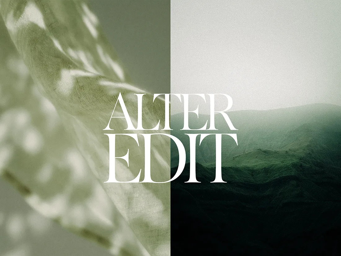
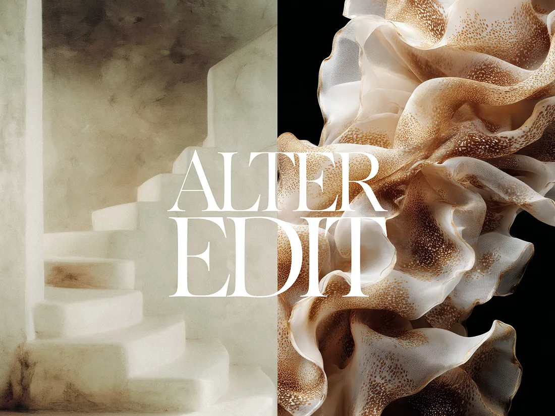
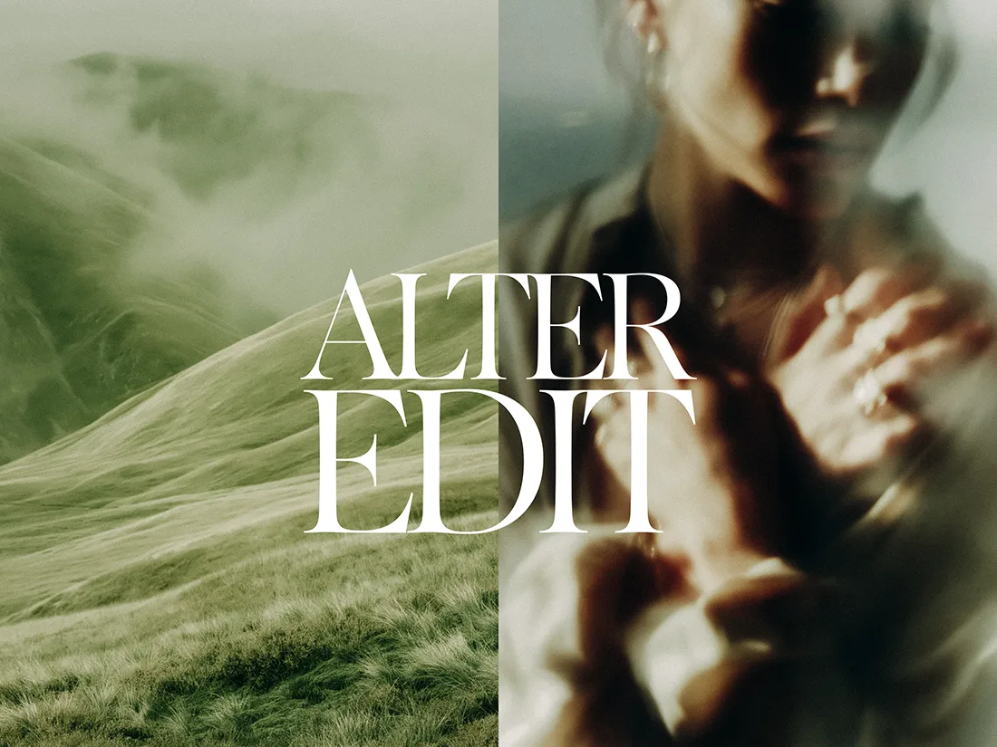
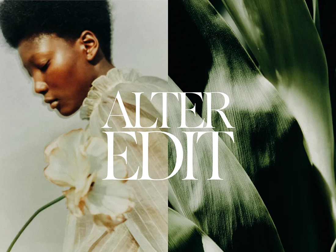
This is the thinking behind Quiet Luxury Vol 3. Where the earlier volumes in this series drew from interior stillness and architectural calm, Vol 3 moves into the natural world. Open landscapes. Botanical detail. Textural surfaces. A palette of sage green, warm stone, dusty rose, and deep botanical green. The same quiet authority. A different visual language.
Where visual inconsistency actually costs you
Most small business owners know their brand could look more consistent. What is less understood is where that inconsistency is actively costing them.
The most common failure point is stock imagery. Images sourced from different libraries, shot in different lighting conditions, with different colour temperatures and compositional styles, create a brand that reads as assembled rather than intentional. Even where the copy is strong and the offer is clear, mismatched imagery creates a perception gap between the brand you are describing and the brand you are presenting.
A curated stock collection built around a single aesthetic closes that gap. It means every piece of content you publish, every platform you appear on, every email your audience opens, is drawing from the same visual world. That coherence accumulates. Over time, it becomes recognition. And recognition becomes trust.
What a unified image library actually gives you
Beyond the psychological impact on your audience, a curated image library has a significant operational benefit. Content batching, one of the most effective strategies for maintaining a consistent social presence without burning out, requires a pool of cohesive images to draw from. When every image in your library belongs to the same visual world, batching becomes fast and the output looks intentional regardless of when it was created.
It also removes a decision that most business owners make badly under time pressure: choosing imagery on the fly. When the library is already curated and cohesive, the decision is already made. You are simply selecting from within a consistent range.
Browse the full Alter Edit stock archive to see every collection available across the Quiet Luxury series and beyond. Each collection is built around a specific aesthetic world and formatted for immediate use across Canva, Squarespace, Showit, and all major design platforms.
Who this collection is for
Coaches, consultants, and service-based founders who want their brand to communicate quality without stating it directly. Designers building visual identities for clients who need a cohesive image library as a foundation. Content creators who batch their output and need a visual aesthetic that stretches consistently across weeks of posting.
Quiet Luxury Vol 3 is 30 editorial stock images formatted at 3:4 aspect-ratio, available as an instant download with a personal and commercial licence included. One purchase. A complete visual library for brands that lead with restraint.
Browse the full stock archive →
“`