
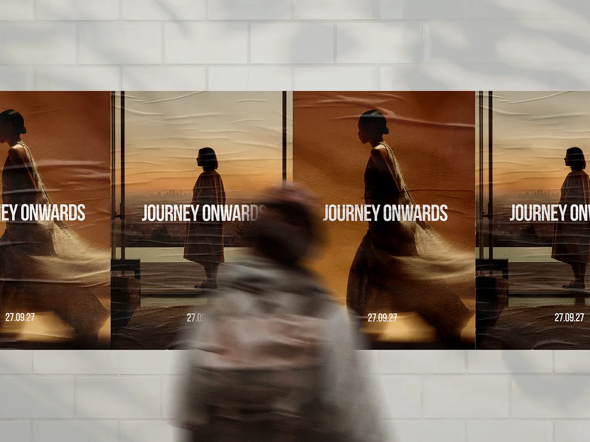

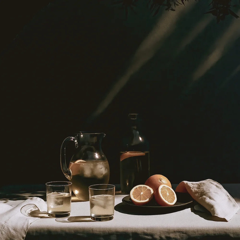
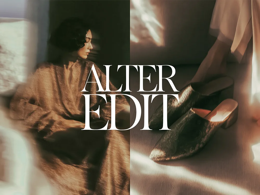
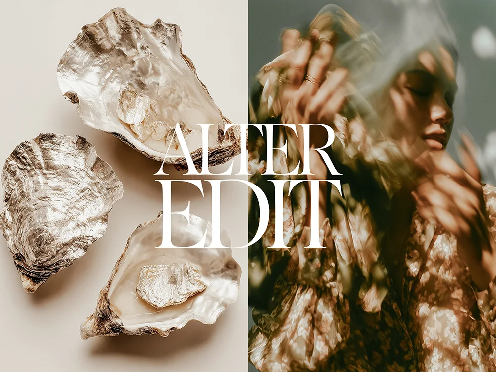
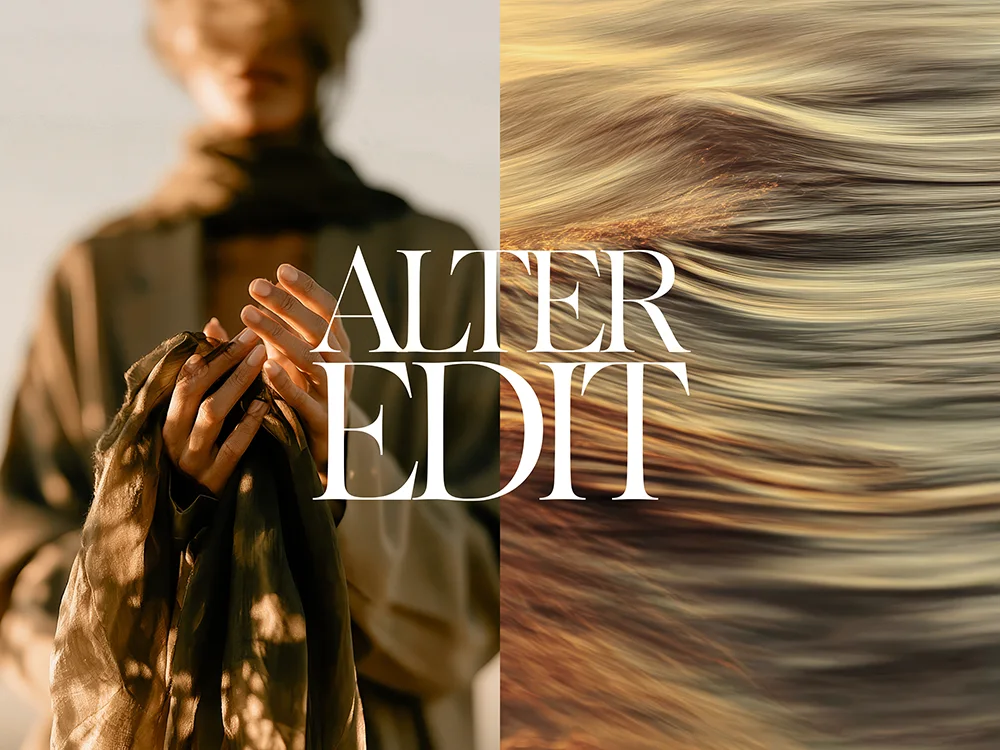
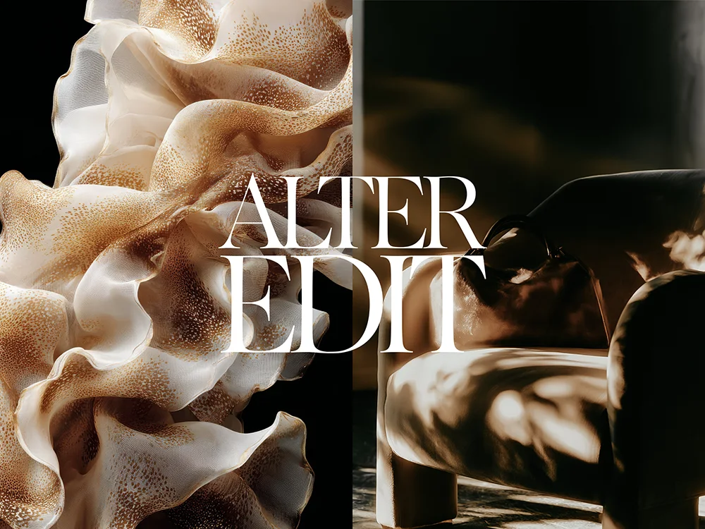
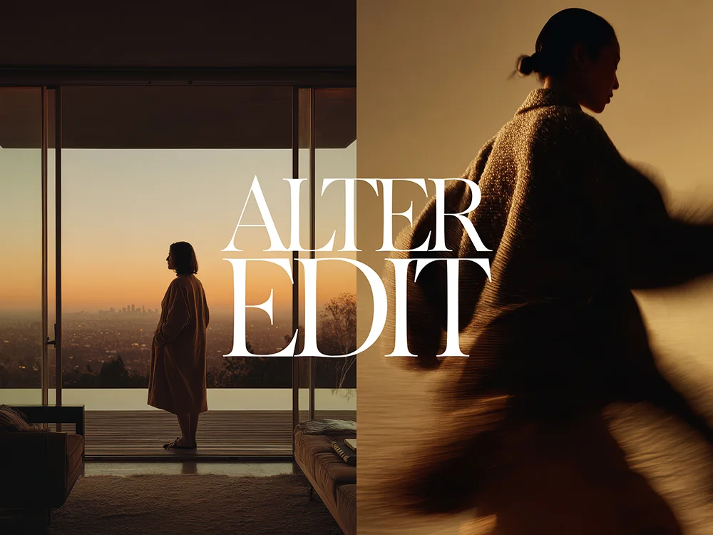
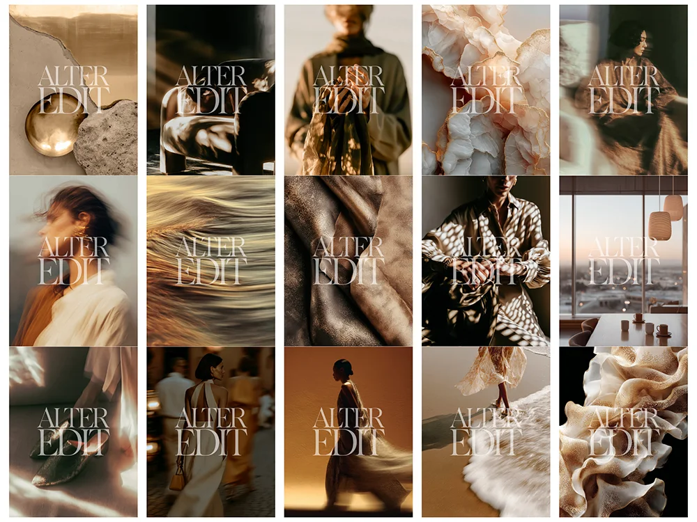

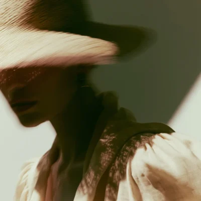
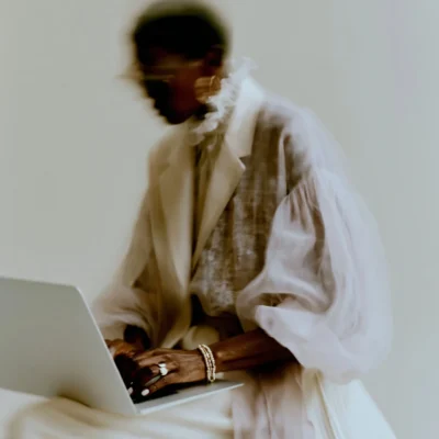
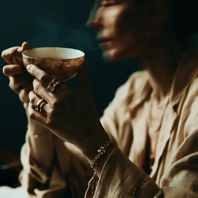
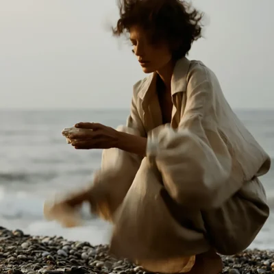
Whether you’re refreshing your brand or creating content for clients, this Quiet Luxury collection delivers a full visual toolkit to keep your brand looking professional, consistent, and on-trend.
Upon purchase you’ll instantly receive a PDF containing a Google Drive link to access all files
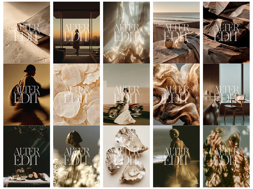
All images 72 dpi – 1506 x 2000px plus contact sheet.
PERFECT FOR
• Instagram posts stories reels
• Pinterest Canva Tiktok templates
• Branding and social media kits
• Graphic and web designers
• Digital entrepreneurs and content creators
• Blogs newsletters moodboards
• Elegant faceless digital marketing visuals
• Female lifestyle and small business branding
• Fashion-forward neutral aesthetic lovers
• Website backgrounds and Squarespace or Showit templates
• Personal brand storytelling
These images have been created with AI and other tools.
WHY THIS COLLECTION WORKS
- STRATEGIC CONSISTENCY. Use these Quiet Luxury Stock Images to ensure your brand looks professional across every platform.
- HIGH-END MARKET POSITIONING. Sophisticated imagery crafted to support your premium brand strategy.
- OPERATIONAL FREEDOM. Bypass the cost of bespoke photoshoots with instant access to polished Quiet Luxury Stock Images.
- DESIGN-LED VERSATILITY. These Quiet Luxury Stock Images are ideal for content batching, launches, and evergreen posts
Reviews
There are no reviews yet.