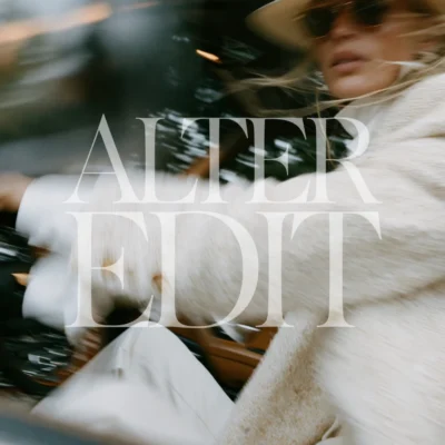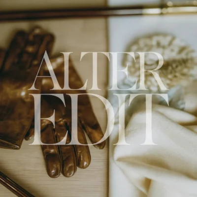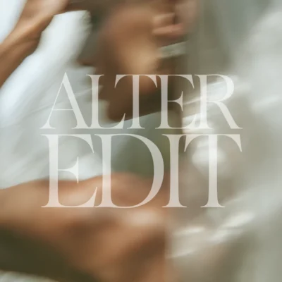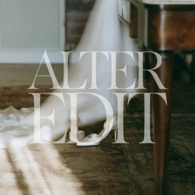
In an overcrowded digital marketplace, high-end brands rarely shout, they curate. Adopting a deliberate strategy around neutral aesthetic stock imagery is one of the fastest ways to signal premium positioning and build instant visual authority with your target audience.
This guide explores why muted, tactile imagery outperforms oversaturated stock photos, how top digital creators use cohesive visual suites to increase conversion rates, and how to seamlessly integrate these assets across your entire marketing ecosystem.
Why generic stock photography destroys brand trust
Most digital entrepreneurs underestimate the subconscious impact of visual friction. When a potential buyer lands on your sales funnel or website, their brain evaluates your credibility in less than 50 milliseconds. If your messaging speaks to premium high-ticket offers but your visuals rely on generic, overly polished imagery from free platforms like Unsplash, you create an immediate disconnect.
Generic stock photos look staged because they are designed to appeal to everyone. They lack texture, intentional lighting, and editorial nuance. Premium buyers recognize these overused visuals instantly, which subtly erodes their perception of your product’s value before they even read your headline.
The psychological power of neutral color palettes
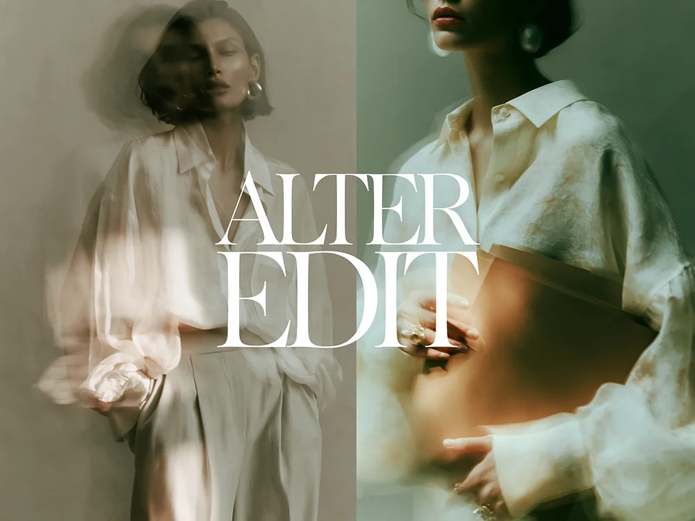
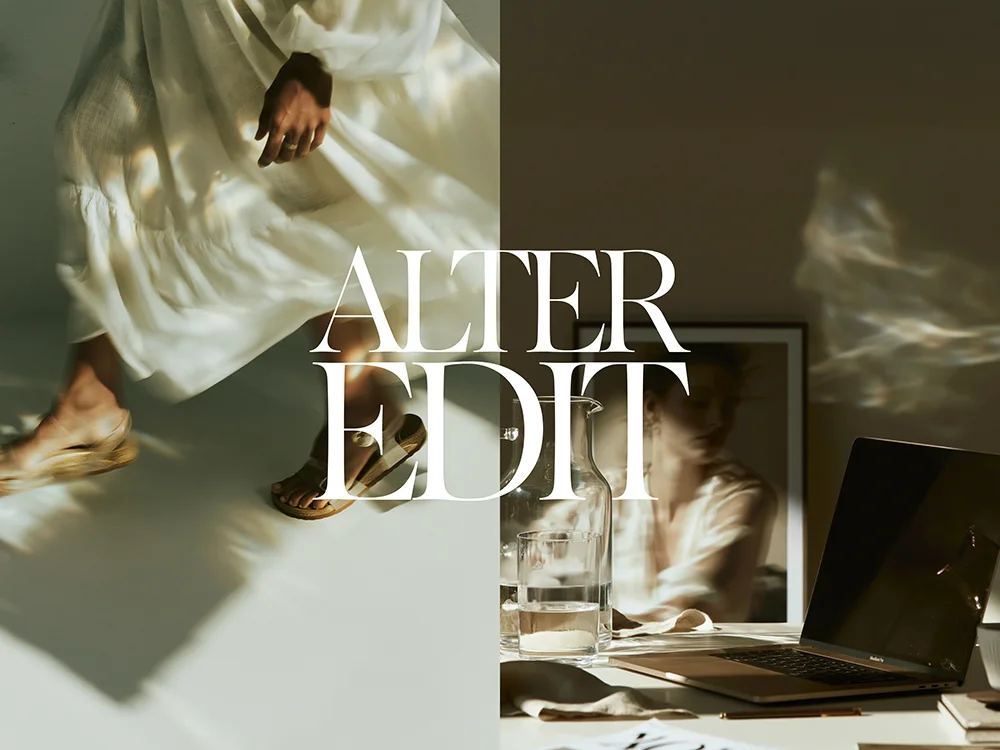
Neutral tones—warm alabaster, soft linen, muted slate, and raw terracotta—act as a visual palette cleanser. In visual design psychology, neutral aesthetic stock imagery reduces cognitive overload, allowing your audience’s focus to land precisely where you want it: on your value proposition, copy, and call-to-action elements.
By removing chaotic colors and high-contrast distractions, neutral photography creates an atmosphere of calm confidence. This aesthetic aligns naturally with modern luxury brands, wellness practitioners, high-end digital agency owners, and course creators who want to convey sophistication without visual noise.
Four strategic ways to deploy neutral imagery across your brand
To maximize the ROI of your visual assets, implement them systematically across every customer touchpoint using design tools like Canva or Adobe Photoshop:
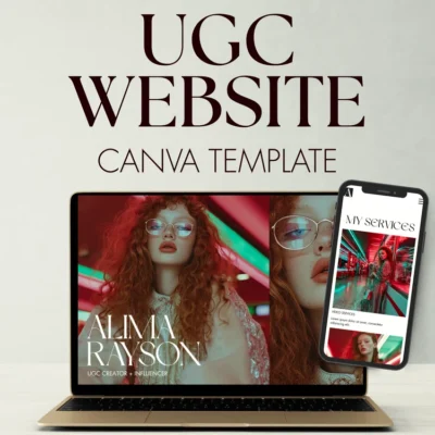
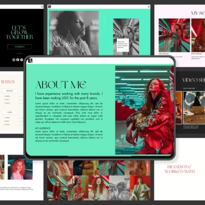
1. Digital Product Mockups & Covers. Frame your website templates, ebooks, or course portal screenshots against muted, tactile backgrounds. Adding organic drop shadows against warm stone or linen textures makes digital downloads feel tangible and high-value.
2. Editorial Social Feeds & Pinterest Hooks. Use imagery with negative space to overlay bold, typography-driven quotes or strategic carousel headers. Pins built with neutral aesthetic stock imagery achieve significantly higher repin rates on platforms like Pinterest due to their clean, aesthetic appeal.
3. Website Hero Sections & Banners. Anchor your homepage and landing page hero sections with understated visual backgrounds that complement your primary font styles without competing for readability.
4. Lead Magnet & PDF Architecture. Elevate internal document layouts, welcome guides, and client onboarding portals by using subtle image breaks to separate dense sections of text.
Building a repeatable visual content workflow
Consistency is where visual branding either succeeds or fails. Rather than hunting for mismatched individual photos every time you need to publish a blog post or launch a campaign, operate from a pre-curated image vault.
Having a centralized visual suite ensures that every image shares the exact same lighting setup, color temperature, and mood. This consistency allows you to build recognizable brand equity across your website, social feeds, and digital product suites with zero creative fatigue.
Upgrade your visual positioning today
Access the complete Neutral Edit Vol. 1 stock collection. Get a curated suite of high-resolution, editorial images designed specifically for modern digital creators and premium brands.